Case Study · Shipped Product · Consumer Insurtech
Total Loss Helper
Turning the same explanation I gave fifty times a day into a two-minute, personalized action plan
When a car is declared a total loss, the owner receives a 20-page valuation report and a number. Most people read the number and stop. I spent five years explaining what the other 19 pages mean and what actually changes the figure. Total Loss Helper puts that explanation in a box: six questions, or the report PDF itself, produce a prioritized plan of what to verify, what documentation helps, and what doesn't affect the value. It shipped in a weekend, and then it changed audience.
Role
Product Designer · Researcher · Builder (solo)
Project Type
Consumer decision-support tool · Insurance
Responsibilities
Domain research · Content design · Interaction design · Front-end build · Analytics
Status
Live · shipped August 2026 · v0.5
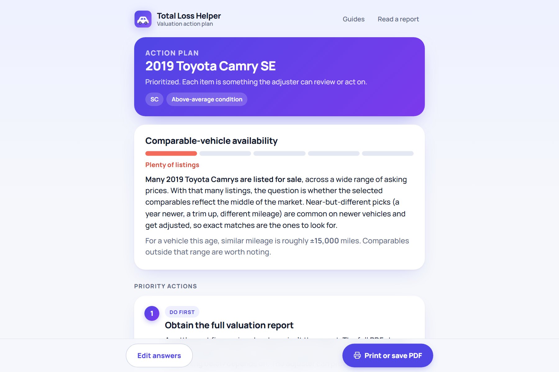
Six questions or one PDF → prioritized plan the adjuster can act on
6
questions to a personalized plan
~2 min
to complete, no signup
0
bytes of user data stored
1 weekend
from interview notes to live
The Problem
The report answers every question. Almost nobody can read it.
A total-loss valuation is built from comparable vehicles: recent listings similar to the owner's car, adjusted for mileage, options, and condition. Everything that can change the number is visible in the report. But the report is written for adjusters and appraisers, and the owner is reading it on the worst week of their year.
So owners do what people do: they search the internet, ask an AI, and arrive at the adjuster with a list of requests that can't be acted on. The requests that would work, such as a trim correction, a rerun limited to the same year and trim, or condition documentation for specific components, never come up. I was the person on the other end of that call, fifty times a day.
Reading, not doing
Existing advice is long-form: forum threads, articles, generic dispute-letter templates. None of it knows which three things matter for this car.
Wrong requests
Owners argue the mileage formula or send the five most expensive listings they can find. Neither moves the number, and both cost credibility.
Adjusters repeat themselves
Every valuation conversation covers the same ground: what comparables are, why dealer prices differ, what documentation counts.
Research
The subject-matter expert was me. That was the risk, not the shortcut.
I started with a structured knowledge interview of myself: every rule, threshold, and exception I apply on the job, captured verbatim before it was organized. Then I sorted it into what an owner can observe and act on, what is opinion, and what is internal and never publishable. Only the first category became product.
The organized knowledge covered comparable-vehicle matching, mileage bands by vehicle age, the four condition rungs, refurbishment credits, title flags, and the states with their own rules. Each rule became a branch in the plan generator, tagged with the evidence an owner would need to bring.
The Product
Two ways in, one plan out
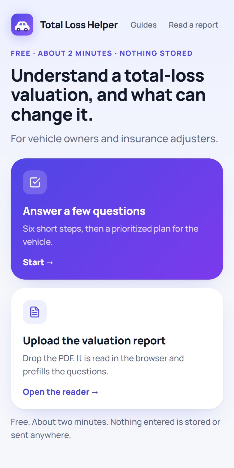
An owner with only a phone number goes through six short steps. An owner with the report PDF drops it in, and the reader parses the comparables, condition ratings, and adjustments in the browser, then prefills the same steps with real numbers. Either way the output is the same object: a ranked list of requests, each with a one-paragraph reason.
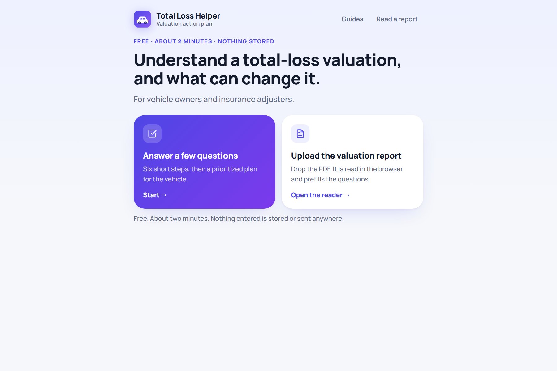
Entry
Who it is for and two ways in: answer questions or upload the report. No explaining before the first tap, and nothing entered is stored.
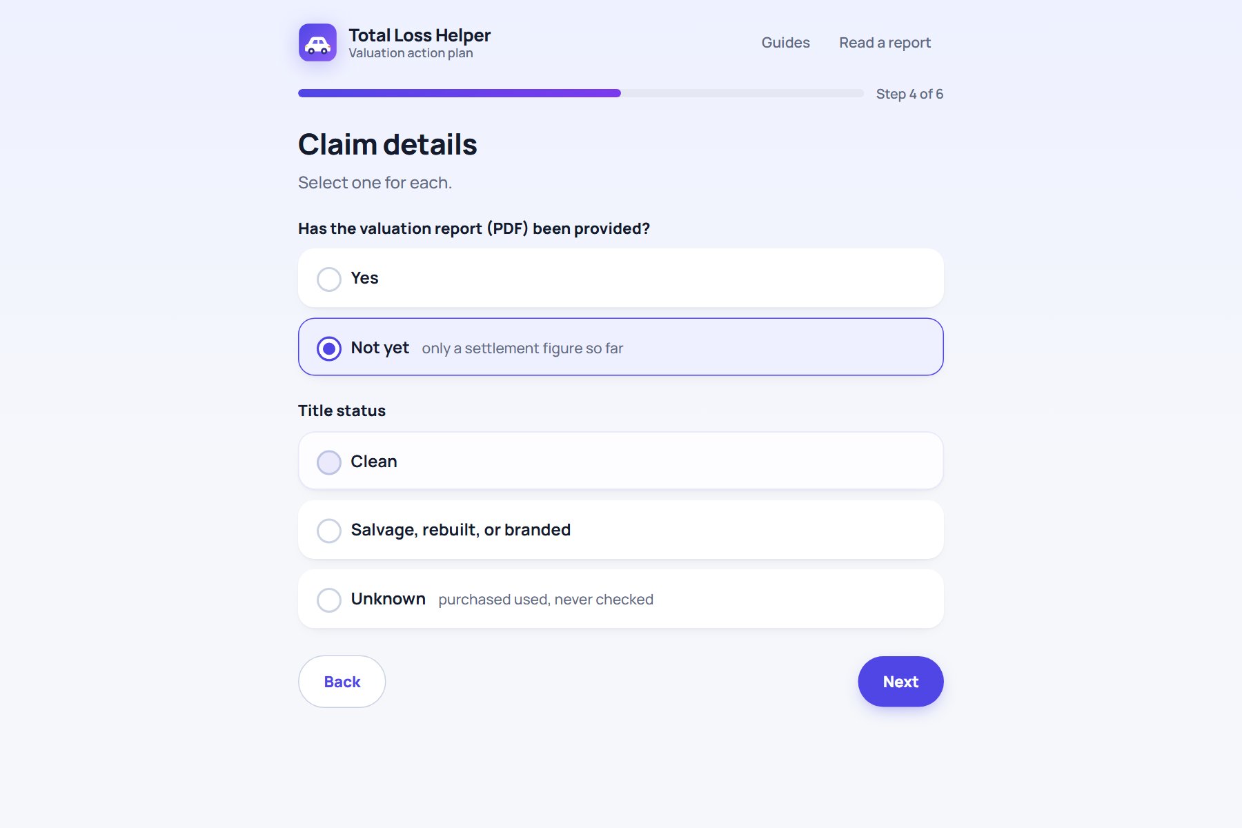
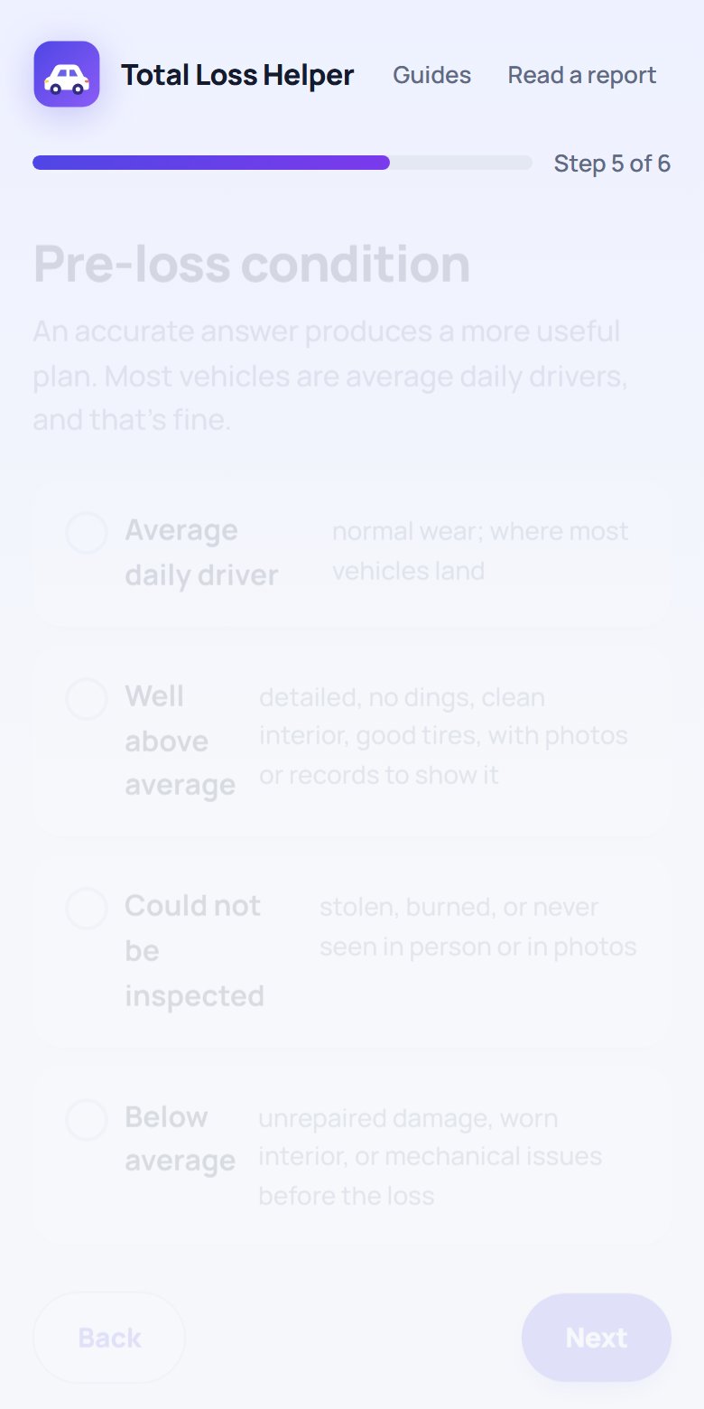
Short, form-style steps
Each answer switches specific branches on or off. An unknown title, a financed vehicle, or a vehicle that could not be inspected each adds its own card to the plan.
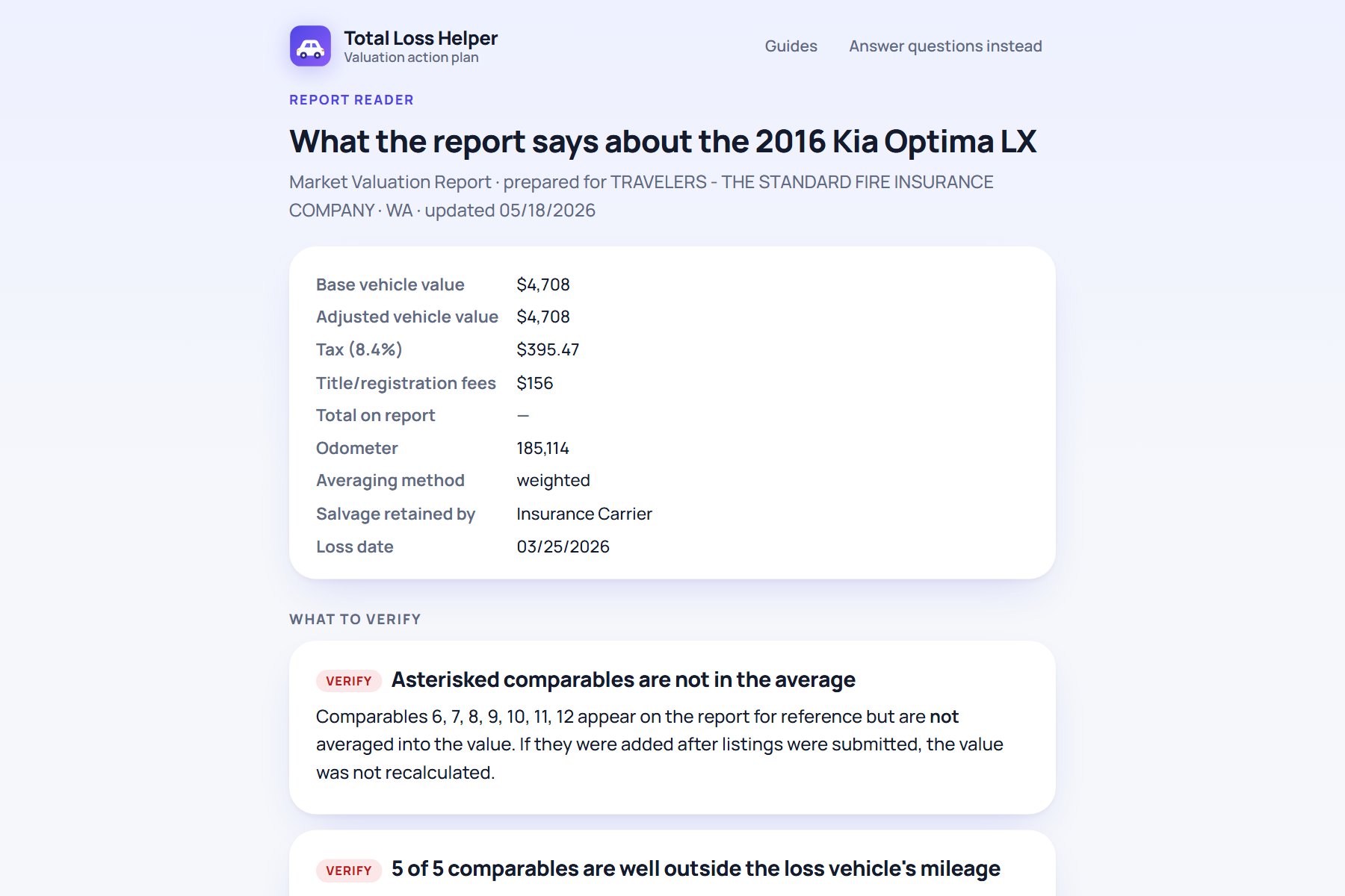
Report reader
The PDF is parsed client-side. Every comparable's mileage, distance, and adjustments are extracted, and findings are sorted into verify, note, and OK.
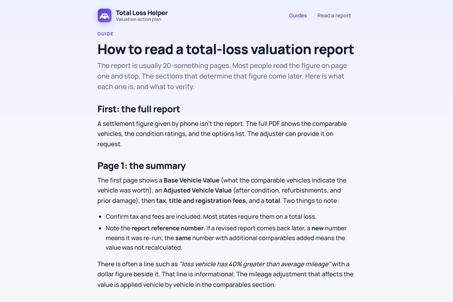
Guides
Four plain-English explainers cover the questions that come up on every call. Each one ends in the tool, so reading leads to doing.
Design Decisions
Four decisions that shaped it
Decision 01
A plan, not a guide
The first draft was a long-form guide. It was accurate and nobody would read it. The pivot was to make the content conditional: ask a few things, then show only the branches that apply, ranked. The guide became the content source; the wizard became the product.
Decision 02
Ask for honesty, and design for it
The condition question is the one people are tempted to inflate. It is framed with a reminder that an average daily driver is the normal answer and that the plan will focus elsewhere. Owners who choose it get a plan that spends their credibility on requests that work.
Decision 03
Every request must be actionable by the adjuster
The methodology can't be changed at the claim level. So the plan never argues the formula. It converts each situation into something an adjuster can submit: a trim re-check, a rerun limited to the same year and trim, comparables closer in mileage, documentation for a specific component.
Decision 04
Read the report in the browser, never upload it
The PDF contains the owner's name, address, and claim number. The reader runs entirely client-side with pdf.js. No file leaves the device, which is both the right privacy call and the reason the report path could ship without a backend.
What Changed After Launch
The audience I designed for wasn't the one who showed up
I wrote version one for vehicle owners, in an owner's voice: "your car," "what to ask for," an escalation ladder for when the conversation stalls. Then adjusters started sharing it with their customers as a pre-call explainer, and newer adjusters were using it to learn the valuation themselves. Read through an adjuster's eyes, the owner-advocate framing was a problem: it made the process sound adversarial, and it put the person sharing it in an awkward spot.
Version 0.5 kept every rule and rewrote every sentence. The register moved from second person to a neutral process explainer. The escalation ladder became "if the value still seems off," with the two steps that are actually part of the process. "Don't bother with" became "what doesn't change the value," which turned out to be the section adjusters value most. Requests were reframed as things the adjuster can submit, and the scripted lines for owners to say were dropped. The redesign of the interface happened in the same pass: a real identity, form-style steps, numbered action cards, and a print-ready plan. A later pass moved to the indigo palette and cut the first screen to a headline and two choices.
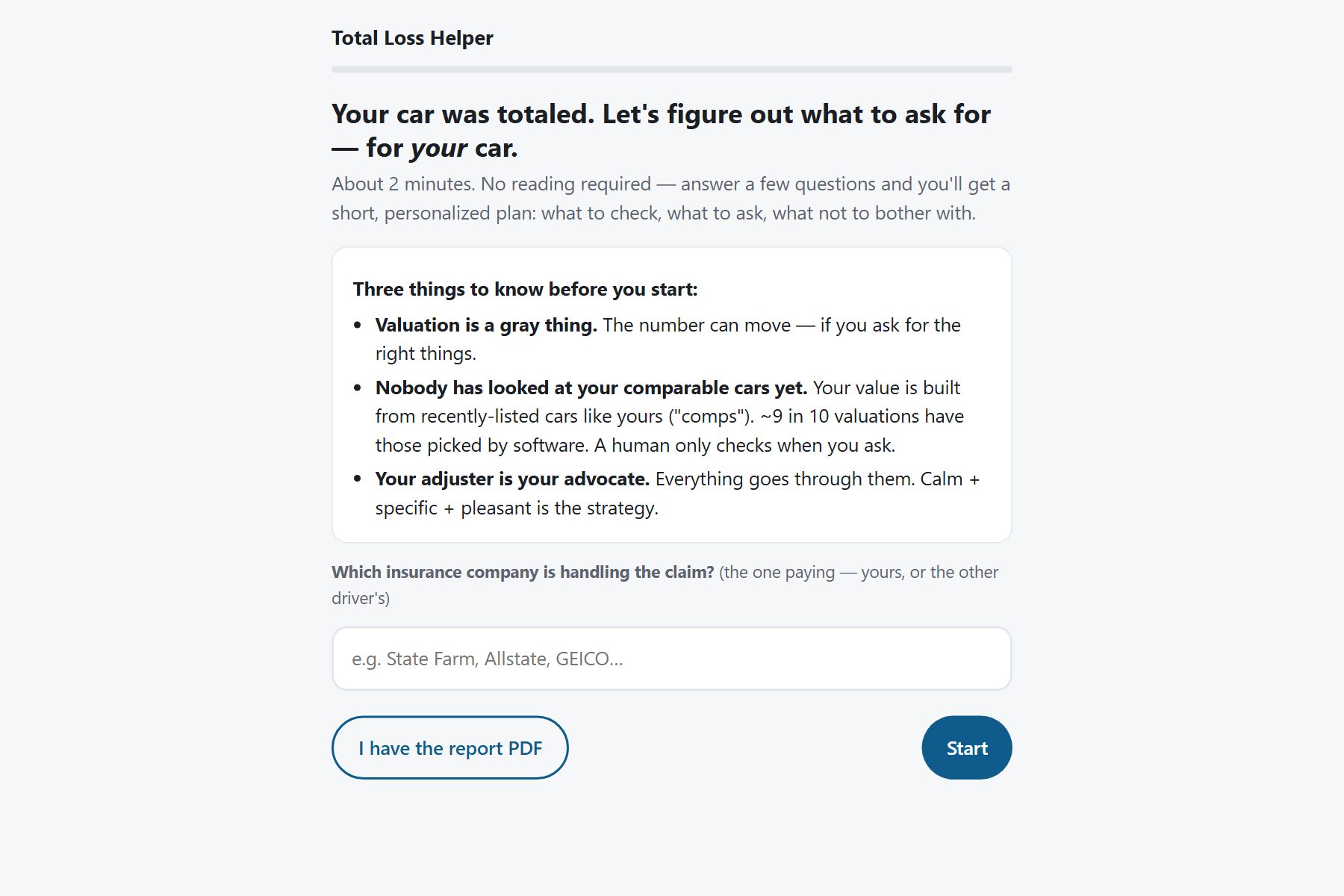
Before (v0.4)
Owner's voice. 'Valuation is a gray thing.' An insurer question up front. Correct, and the wrong tone for an adjuster to hand to a customer.
After (v0.5)
Neutral register, shorter, same facts, and a first screen that gets out of the way. Written so that an adjuster can share it without explaining it.
Mobile First
Most owners open it from a text message
The link travels by text and email, so the phone is the primary surface. Every step fits one screen without scrolling to the Next button, the option cards are full-width tap targets, and the plan prints cleanly from the phone's share sheet.
One file, no framework, no backend. The whole product is static HTML and a few kilobytes of rules, which is what made a weekend ship possible and keeps hosting free.
Live Product
Try it with any car
Free, no signup, nothing stored. Answer six questions, or drop a valuation report PDF and watch it read the comparables.
Open Total Loss HelperShipped product · Browser based · Educational only
Measurement
What I'm watching
The tool instruments four events: started, plan built, report parsed, and feedback. A one-tap "was this useful" card at the end of every plan collects a vote and an optional comment with the plan's context attached, so I can see which branches produce confusion.
Completion
Started versus plan built. If people drop out at a step, the question is wrong or too long.
Report path adoption
How often the PDF reader is used versus the questions. Parsing failures on unusual layouts are logged for fixes.
Feedback by branch
Votes and comments are tagged with vehicle, state, claim type, and condition, so a bad plan can be traced to the rule that produced it.
Reflection
What this project taught me
1
Expertise is a liability until it's structured
Knowing the process cold made it tempting to write everything down. The product only worked once the knowledge was split into branches and each branch was tied to evidence a user could actually bring.
2
Tone is a feature
The same facts, in the wrong register, made a helpful tool feel adversarial to half its audience. The rewrite changed no rules and changed who could share it.
3
Design for the person who has to act
The owner reads the plan, but the adjuster acts on it. Framing every item as a request the adjuster can submit made the plan useful to both at once.
4
Ship, then listen
A weekend prototype in front of real users taught me more about audience than any amount of planning would have. Version 0.5 exists because version 0.4 was live.
The goal was never to beat the valuation.
It was to make the right conversation easy to have.
Owners bring the evidence that matters. Adjusters get requests they can act on. The number lands where the market says it should.
Total Loss Helper
Role
Product Designer · Researcher · Builder (solo)
Project Type
Consumer decision-support tool · Insurance
Responsibilities
Domain research · Content design · Interaction design · Front-end build · Analytics
Status
Live · shipped August 2026 · v0.5