UDEX: Universal Document Exchange
A Case Study in Streamlining Insurance Workflows
| My Role | Timeline | Tools Used |
|---|---|---|
| UX/UI Designer, Researcher, Prototyper | 4 weeks | Pen & Paper, Figma, Supabase |
The Problem
As an insurance valuation agent, I experienced firsthand the daily chaos of managing document-heavy requests across five separate Outlook inboxes. This decentralized system led to a host of problems:
Lost Documents: Critical files would get buried in email chains or sent to the wrong inbox.
Customer Confusion: Insurance adjusters (our customers) were constantly confused about which email address to use for specific requests.
Operational Inefficiency: A dedicated team member had to manually sort and route every single email, creating a significant bottleneck.
Lack of Transparency: With no visibility into the process, adjusters would frequently call for status updates. In fact, 20% of our customer service calls were simply to ask, "Is it done yet?"
This inefficient workflow created frustration for both our customers and our internal team, wasting time and resources while increasing the risk of errors.
The Opportunity
I saw a clear opportunity to design a solution that would benefit both user groups simultaneously. By creating a single, centralized platform, we could:
For Adjusters: Provide a simple, transparent way to submit and track requests.
For Agents: Streamline the intake and routing process, allowing them to focus on their actual work.
My goal was to design a system that felt as intuitive and transparent as tracking a food delivery order.
My Approach
My deep domain expertise was my greatest asset. By speaking with adjusters and agents daily, I had a unique, firsthand understanding of their pain points and needs. I didn't need to conduct formal interviews because I was living the user research every day.
My process was as follows:
Problem Definition: I mapped out the existing email workflow and identified all the key friction points.
Ideation & Sketching: I started with hand-drawn wireframes to brainstorm the core screens and user flows for both the adjuster and agent sides of the platform.
Prototyping: I translated my sketches into a high-fidelity, interactive prototype in Figma to demonstrate the complete user journey.
User-Centered Design: Throughout the process, I focused on creating an experience that was simple, intuitive, and addressed the specific frustrations I knew both user groups faced.
The Solution: UDEX Prototype
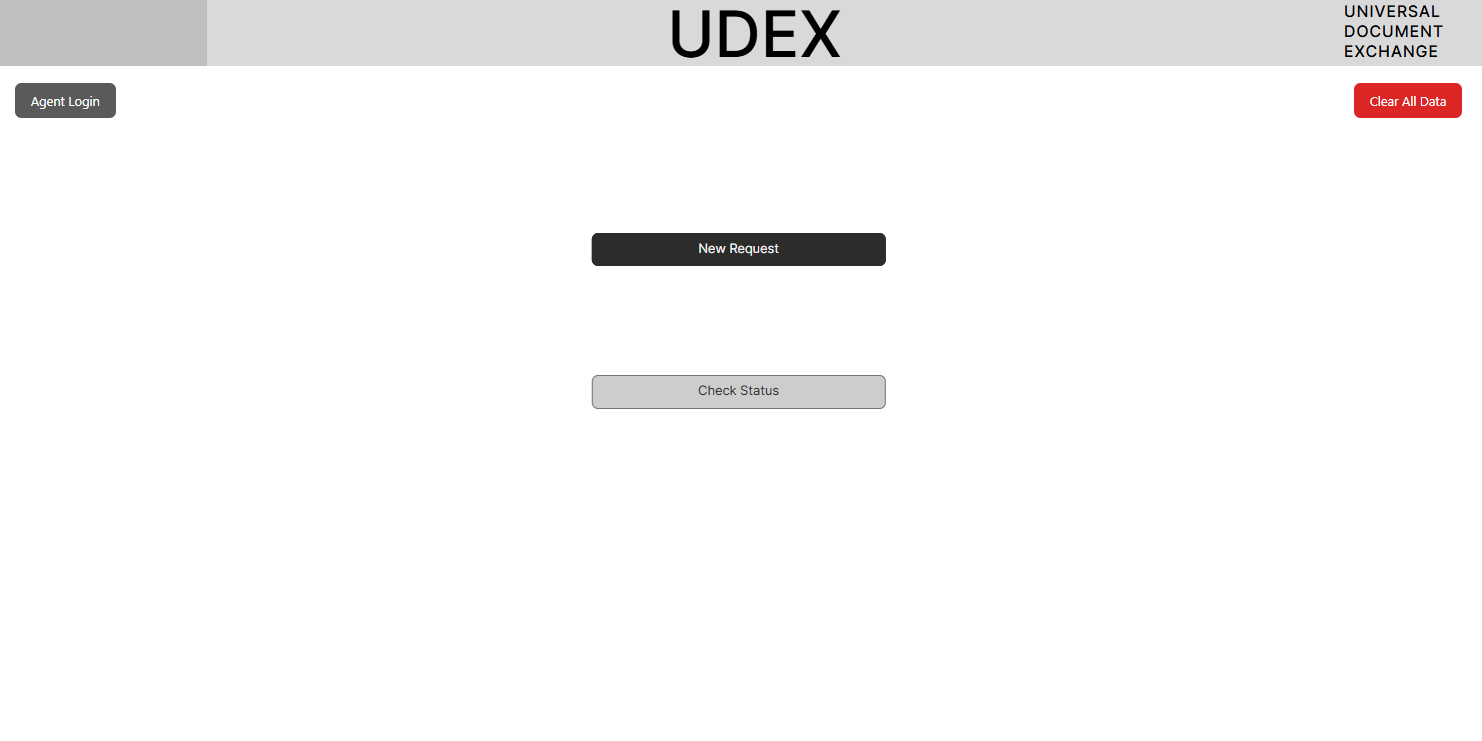
The result is UDEX: Universal Document Exchange, a comprehensive Figma prototype that demonstrates a complete, end-to-end solution.
Key Features
| Feature | Benefit |
|---|---|
| Single Submission Portal | Eliminates confusion by providing one place for all request types. |
| Automatic Routing | The system automatically categorizes requests, removing the need for manual sorting. |
| Real-Time Status Tracking | Adjusters can see the status of their request from "Submitted" to "Complete," just like a DoorDash order. |
| Centralized Agent Dashboard | Agents have a clear, organized view of all incoming requests, filterable and searchable. |
| Direct Notes & Communication | Agents can add notes directly to a request, keeping the adjuster informed without needing a separate email. |
The Pitch
A prototype alone doesn’t change a workflow. For UDEX to have a real chance inside CCC, leadership needed to see the operational cost of the current process and the business case for testing a better one.
So I built a pitch deck around five composite users: four partners trying to move document requests out of email, and one Customer Service rep absorbing the cost of every “Where is it?” call. Instead of presenting UDEX as a list of features, I walked each persona through the same request twice — first through the current inbox-driven process, then through the proposed UDEX flow.
The deck translated those scenarios into three business outcomes: clearer request ownership, faster status visibility, and fewer repeat contacts. It closed with a low-risk proposal: a two-to-four-week pilot, named success metrics, and one accountable stakeholder to evaluate whether the workflow was worth pursuing.
The pilot was not approved, but the process became one of the most important parts of the project. It taught me that UX work doesn’t end at the prototype; it also includes framing the problem, aligning stakeholders, and making the path to adoption concrete enough for an organization to act on.
Meet the personas
Composites drawn from the adjusters, appraisers, and Customer Service reps I worked with every day. Each scenario in the deck runs one of them through the same request twice — today's inbox maze, then UDEX.

Married, two grown kids, weekends fishing. Works from his truck more than a desk.
Get the BCIF entered right the first time and move on to the next inspection.
Silence after he submits — and when he does call, getting routed to the AI phone system he can't stand. He'll happily talk to a person; he'd rather just see the status.

New to the role and recently moved cities. Still learning which inbox is which.
Do it right and be taken seriously.
Losing days to a wrong-inbox mistake the system practically set her up for.

Works from home — kids or cartoons are often audible in the background.
Close files before the customer's rental car runs out, and keep her customers calm.
Being asked to resend things she can't prove she ever sent, and having no answer when the customer asks where it stands.

Coaches his son's soccer team. A hard worker who stays on top of a heavy caseload.
Keep his caseload moving and his customers from boiling over — every claim has a rental-car clock on it.
Becoming the messenger: forwarding comparables he knows won't work, then going back to an already-unhappy customer to say so.

Caregiver for her mom. The calm voice on the other end of the phone.
Make adjusters' and appraisers' jobs easier.
Hunting through inboxes she can't always access — and the embarrassment of telling a caller it was finished long ago and nobody knew, or that it got lost.
The deck
Use the arrows or dots to move through the deck — swipe on mobile. Persona names are illustrative; scenarios are drawn from real requests.
The (Potential) Impact
While this prototype was a conceptual project and not implemented by my company, its potential impact is clear:
Drastically Reduce Phone Calls: By providing real-time status updates, we could virtually eliminate the 20% of calls that are just status checks.
Increase Efficiency: Automating the routing and organization of requests would save significant time for the internal team.
Improve Customer Satisfaction: A transparent, easy-to-use system would enhance the adjuster experience and reduce their frustration.
Eliminate Lost Documents: A centralized system ensures every document is attached to the correct request and easily accessible.
What I Learned
This project was a powerful lesson in proactivity and problem-solving. I learned that you don't need to wait for permission to identify and solve a problem. By using my domain knowledge and design skills, I was able to create a comprehensive solution that could have a real, measurable impact on the business.
It also reinforced the value of starting with low-fidelity sketches to quickly iterate on ideas before committing to a high-fidelity design in Figma. Even though it wasn't adopted, the process of creating UDEX was a valuable exercise in applying UX principles to solve a complex, real-world business challenge.